TL;DR analysis of Toronto’s Bike Share & cycling infrastructure using Power BI – see interactive report below.
This past fall, I spent some time looking into Toronto’s Bike Share and cycling infrastructure networks. This research culminated into the report you see above.
Some background – I am passionate about cycling, riding nearly every day for most of the year as my primary source of transportation. As such, cycling infrastructure is of huge importance to me, as is getting more people riding during this ongoing global climate emergency.
But that’s not really why I started this project.
In reality, I wanted to learn more about effectively using geospatial data. I had never worked with geospatial data in the past, and this seemed like a great way to get started, as well as dive into a topic that I’m truly interested in. Wrap it all up in a public facing Power BI report and here we are!
For those unaware, Bike Share Toronto allows users 24/7 access to a fleet of rental bicycles designed for short trips within the city. A user can rent a bike from any station (or dock) and return it to any station within the network.
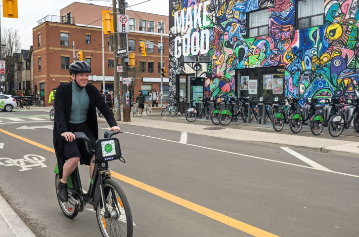
Background: Bike Share docking station.
Source: The Signal. Photo by Robyn Miyuki Hughes.
My goals for this project (besides learning more about the wild world of geospatial data) were pretty simple:
- Visualize and identify areas where the Bike Share network is underdeveloped.
- Visualize and identify gaps within the Toronto cycling network, especially when it comes to safe, protected infrastructure.
- Allow a user to explore neighbourhoods that are underserviced within each network, and analyze them from the lens of income, etc.
Ultimately, I wanted a user to be able to visually explore both networks and see for themselves the clear gaps that exist (especially outside of the borough of Old Toronto). I won’t push my agenda or findings any further here – if you haven’t already, explore the report above and come to your own conclusions. I’m sure you’ll discover something that you find interesting.
As for the data feeding this report, all of it came from the Toronto Open Data Portal. Data was collected on the following topics (hyperlinks to the data sources):
- Bike Share Station Info & Locations
- Bike Share Usage
- Cycling Infrastructure Shapes
- Census Statistics by Social Planning Neighbourhood
- Social Planning Neighbourhood Shapes
One of the main challenges of this project was figuring out how to slice the data by social planning neighbourhood. These neighbourhoods are the way the Toronto city government divides the city’s area for urban planning purposes. Unfortunately, neither the Bike Share station locations, nor the cycling infrastructure datasets included these neighbourhoods. To remedy this, I used the GeoPandas Python package to perform a spatial join and map stations and infrastructure into their respective neighbourhoods.
Without getting into unnecessary details on the data used or cleansing performed, you can see a high level visual depicting the data transformations below.
It wouldn’t be fair for me to end this post without mentioning Bike Share Toronto’s Four-Year Growth Plan that was unveiled as I was finishing up this project. Many of the key takeaways I wanted a user to come away with are being addressed by this plan. People with more time, resources, and knowledge than myself created it and I highly recommend checking it out if you have any interest in cycling within Toronto.
Additionally, you’ll notice in my Power BI report, the city is split into 140 social planning neighbourhoods. As of Spring 2022 there are now 158 neighbourhoods as the City divided some up into smaller areas as their populations grew. As of when I was building my report, the City hasn’t released compiled census data for the new set of neighbourhoods. As a result, you’ll see 140 neighbourhoods and demographic data from the 2016 census.
If you’re interested in making cycling a safe and accessible option for the thousands of Torontonians in which it is not, check out the final page of my report above. Also, let your City Councillor know that safe cycling infrastructure is important to you, and consider donating time or money to advocacy groups such as Cycle Toronto who do great work in this space.
If you have any questions about this project, feel free to shoot me an email at stephen@gidge.dev. Also, if you’re interested in a deeper dive of the data, how this report works, or the message I want to convey, please reach out – I’m happy to chat more. I hope this makes you really think about factors that affect cycling accessibility in cities. Thanks for reading!
Cheers,
Stephen
LinkedIn Reddit Facebook Twitter